Like a Professional: Ultimate Guide to Font Pairing
Are you searching for a creative way to add a professional look to your design? It would help if you preferred Modern fonts associated with amazing eccentric even if it looks unusual. We know that font classification has emerged right now, and because of the increase in quality, many designers focus on choosing suitable modern fonts pairing options.
Choosing the right font pairings is essential because it can allow us to get a great design. Still, many people experience complications when it comes to picking great fonts. Even it can seem like an impossible task, but now it is simple by reading this article. Here are some of the best font pairings that allows you to bring creativity to your next design,
Most importantly, these kinds of font pairs are lovely when you try a new design for your next logo, invitation, postcard, presentation, infographic, etc.
Of course, there is a science and technique to applying a heading, body, or subheading.
What to Consider When Pairing Fonts
In our guide to the best fonts for websites, we summarized the key characteristics to look for:
- Don’t Mix Different Moods:
When it comes to the pairing font, you should recognize that each font has a personality & a mood. Try to avoid mixing different perspectives while pairing fonts.
- Style
You should select font types & fonts with styles because this will easily attract a massive audience. Most importantly, you should align it well with your brand. However, you can also tell visitors about service or brand by choosing the right fonts.
- Avoid Discordant Combinations:
Be careful about discord. The first should create visual harmony, and the second repel readers. When it comes to combining fonts, the first glance seems to be different.
- Allocate Separate Roles To Each Font
It is also crucial to create a professional-looking design to assign a role to each font that you use throughout your document.
- Select Fonts From The Same Typeface:
It is better to use different fonts from the same typeface because this will allow you to save time and produce and enable you to do well.
- Mix A Serif With A Sans Serif:
You should know the difference between a sans serif and a serif font.
- Complimentary Fonts
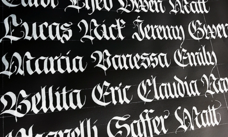
Many fonts come with some unique distinct moods or personalities; if you want to bring some creative aspects, you must use them based on your design’s purpose. For example, script or calligraphic typeface has become famous for wedding invitations, but it is not suitable for the business newsletter.
- Stay Away From Same Classifications:
You must avoid choosing typefaces from the same categories; for example, try to avoid choosing Script or Slabs. Think differently to add uniqueness to the design.
Conclusion:
So take the above guide and Experiment. Also, Use your intuition to bring something better. This font pairing will be helpful for designers to get some idea, so try to consider these typography basics. These are the starting point, and even this will serve you well, so try to use them to stifle your creativity.


